Hi Guys! It's Wednesday, and you know what that means around here:
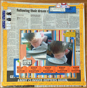
Layout of the Week! I decided to use newspaper in our layout-don't quite know what made me choose that.
I used real newspaper- which isn't archivally safe- I don't mind. But if you'd rather, there's different scrapbook papers with print on them (made to look like old dictionary pages). If you're a digital scrapper, I'm sure you can download a newsprint pattern or book page print.
 |
Supplies:
1 piece of card stock- doesn't matter what color as it's going to be covered with newspaper
newspaper
scrap piece of pattern paper (bright or multi-colored would be best)
markers that match your pattern paper
journaling card
adhesive
ruler
scissors |
 |
First, you'll want to cover your cardstock with the newspaper. You can use a glue stick or Mod Podge. Make sure you get enough adhesive along the edges so they don't peel up. Smooth the paper out with your hand or a brayer. Mine has a few wrinkles- it adds character:)
Now flip it over and trim along the edges of the card stock so it looks like you have a 12"x12" piece of newspaper.
Now use your ruler and markers to draw lines around the edges- this will be your border and will add color to the layout. I used four different colors to match the scrapbook paper I chose. |
 |
| Next, take your piece of pattern paper and draw 3 circles on the back of it. You want one large and two medium. I freehanded my circles- and you can tell! It was the look I was going for. You may trace around a cup or bowl if you'd like a more perfect circle. |
 |
| Cut the circles out. Then cut the centers out of the circles so you just have an outline. Once again, this doesn't have to be perfect-it adds to the "handmade" look. |
 |
| Decide where you want the circles. You may want to wait to adhere them until you decide where you're going to place the other elements. |
 |
| Place the title at the bottom left corner overlapping the circle there. I could see that my title was going to extend to the center of the page, so I waited to adhere the last two letters until after placing my photos. |
 |
| Add your photos. I cut mine smaller to fit more on the page. You could place a 4"x 6" photo in the upper left corner. At the bottom right corner, you could do a photo collage similar to what I did or use a vertical 4"x6" or 5"x7" photo. |
 |
Now place your journaling card in the blank area above the photos. I felt like mine was too big for the area, so I cut it in half.
To finish off the layout, I used a piece of scrap paper and freehand cut out three circles and placed them around the layout: one in the upper left corner overlapping a photo, one in the bottom right corner, and one up on the journaling card.
Hmm, scraps and newspaper- I think this may be the cheapest layout yet!:) |
 |
| In this layout, I cut a heart out of newspaper and sewed it to a piece of card stock. |
 |
Here's one more example of using newspaper as the background for a layout.
The only thing I suggest when scrapping with newspaper is to use bright colors with it. |
Thanks for stopping by and God bless!
This post is linked to


Hi Laura! Thanks for stopping by my blog and leaving me a comment! Your layout turned out great! I love using what I have at home so using the newspaper to make it seems a perfect idea to me. Great tutorial!
ReplyDeleteGreetings from Spain
Hey, I LOVE this page!! so creative!!!
ReplyDeleteThanks for leaving a comment in my blog, so appreciated!!
Cheers
Andrea
I think this is a great 'reuse' idea! My only suggestion would be to seal the newspaper somehow with a thin layer of gesso or maybe modpodge on both sides in an attempt to protect the newspaper from yellowing after years and years. Thanks for sharing!
ReplyDelete