Every time I do a Layout of the Week, I tell you that it's going to be quick and easy.
Well, this week's layout takes the cake on that!
Because we'll utilize white space to balance out photos, we won't have much to do.
I like keeping things simple:)
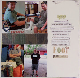
Here's the layout we'll be creating.
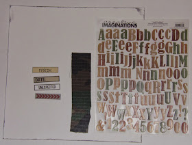
Here's what you'll need to make it:
one piece of 12"x 12" cardstock
one piece of pattern paper measuring 2"x 7"
letter stickers for the title
3-4 embellishments in your theme (I used word stickers)
4 vertical photos measuring 3 1/2" x 5"
adhesive
paper trimmer
There's no need to go out and buy new supplies to make this layout.
Just use what you have on hand.
It's a great way to use up what you've got!
Place your photos on the left side of the page leaving a 2" space in between them.
Place your 2"x 7" piece of pattern paper in the space between your photos.
I wanted to use camouflage paper to match my son's cast, but I didn't have any.
Instead, I cut a strip of camo fabric out of an old pair of shorts.
Place your title on the right side.
I spread out my two words so I would have room to place my journaling.
For your journaling, you can either write in between your title
or print it out from the computer.
I printed mine, then cut it into strips and inked the edges before adhering them.
Now place your embellishments overlapping your photos.
I placed one at the top of the upper left photo,
one at the bottom of the upper right photo,
one in the middle of the lower left photo,
and one right under the bottom word in the title.
My layout is about my son breaking his foot, so in the title, I took the last letter of the title and cut it off at a zigzag then placed it like it was broken off from the rest of the letter.
That's it.
Simple, simple, simple.
Hope you enjoyed it.
Thanks so much for stopping by and God bless.
And I will delight myself in Your commandments, which I love.
Psalm 119:47


No comments:
Post a Comment